| Create a Free Account or Sign In to connect and share in green living and alternative energy forum discussions. |
Nasa Creates Insanely High-Res Map Of America’S Trees
Views: 1860
Feb 28 2012 05:30 PM | eds in Ed's Articles
 According to Robert Simmon, art director of NASA’s Earth Observatory,
. . . the best science communication goes in layers.
You start out with something striking and relatable, and
. . . then you invite your audience to go deeper,
. . . revealing more and more with each new layer.
This is our infographic of the day, but it’s also a story about
. . . the subtle choices that go into good visual information design
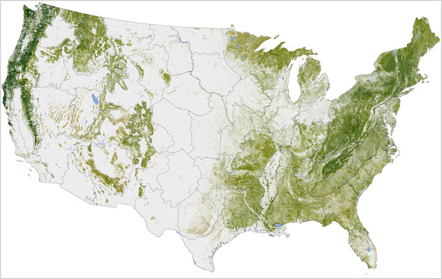
Layer 1: This is a map of where the trees are in the lower 48 states. The data is incredibly high resolution, accurate to within 30 meters, a scale which means that forest managers and researchers can track the disruption caused by things as small as a parking lot or a large building. This stuff is important because forests are one of the largest carbon sinks in the world. Managing our carbon stock is going to be a key part of fighting global warming.
Layer 2: As you zoom in close, you can see fascinating patterns. In some places, the trees almost look like a topographic map, as they trace the patterns of a mountain range. In other places, checkerboard patterns reveal the impact of human clear cutting. Even though this is a map that seems to ignore people, the impact of humanity can still be seen.
Layer 3: The map was created based on data from the Woods Hole Research Center’s (WHRC) National Biomass and Carbon Dataset (NBCD). It’s a baseline estimate of "basal area-weighted canopy height, aboveground live dry biomass, and standing carbon stock" (in other words, trees) for the year 2000.
Source: fastcodesign
