| Create a Free Account or Sign In to connect and share in green living and alternative energy forum discussions. |
Utilities Cry “Fowl” Over Duck Chart
Views: 1655
Jul 21 2014 11:15 PM | eds in Solar Power
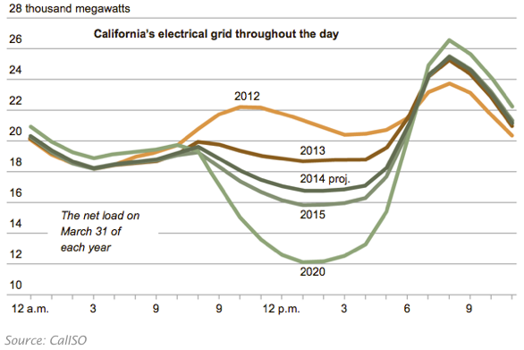 Until 2012, daily energy demand looked like a two-humped “camel,”
. . . with peaks mid-morning and early evening.
Utility operated power plants supplied most of the needed energy.
. . . But the substitution of local solar power to meet local energy needs,
. . . affects the demand for mid-day energy from the grid.
The daily demand curve transforms, from a camel (orange line)
. . . to a (forecast) “duck” (bottom green line).
Utilities point to the duck chart,
. . . . as evidence that renewable energy development,
. . . should be stopped on technical grounds.
But it’s in the belly of the beast we find the real utility problem:
. . . energy demand displaced by solar,
. . . represents lost market share for utilities,
. . . as their customers switch to sunshine.
07-21-2014 Source: Utilities Cry “Fowl” Over Duck Chart
